More subscriptions
to health plans
How redesigning the enrollment journey tripled health plan subscriptions in one year.
Context
The enrollment journey for relatives of Banco do Brasil associates and CASSI employees was long, fragmented, and not very intuitive — causing many users to fail to complete the flow on their own.
To start the process, users had to create a pre-registration and go through several steps of document submission and validations by the CASSI call center. This created strong dependence on human support, rework, and high abandonment rates.
In practice, a large portion of enrollments ended up being completed by phone and email through the call center instead of digital channels.
Goal
- Make the journey continuous and digital, allowing applicants to complete most steps online with minimal call center intervention.
- Reduce friction and unnecessary steps by simplifying forms, documents, and validation rules.
- Increase participant autonomy, encouraging enrollment through the portal and app instead of assisted channels.
Key challenges
Low information clarity and too many form fields, increasing errors, rework, and abandonment.
Mandatory pre-registration and account creation at the start, before users understood plans, pricing, and required documents.
Long process with confusing steps and strong dependence on the call center to complete enrollment.
Lack of visibility into proposal status, document submission, and next steps — causing insecurity and repeated contact with the call center.
My role
- Led discovery activities, including mapping the previous journey and conducting interviews with users and internal teams.
- Defined final flows and reviewed business rules with IT, the call center, and business areas.
- Built the future journey as a high-fidelity prototype in Figma, using variables to test multiple scenarios.
- Prioritized ideas and backlog based on brainstorming sessions, empathy maps, detailed journey mapping, and research insights.
- Followed the UX to UI cycle through handoff to the development team.
Solution
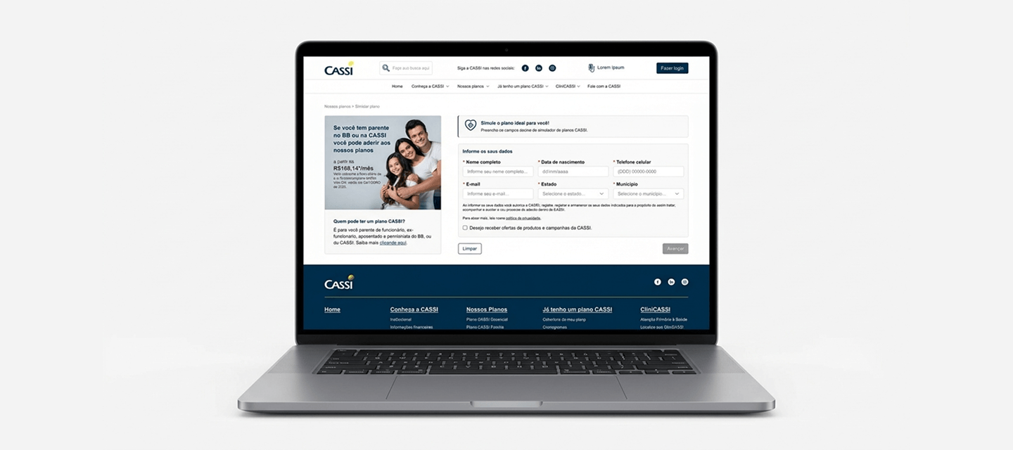
- Removed initial pre-registration — allowing users to progress through the flow before creating an account, reducing the entry barrier.
- Complete redesign of the enrollment flow — with fewer steps, clearer language, and forms focused only on essential information at each stage.
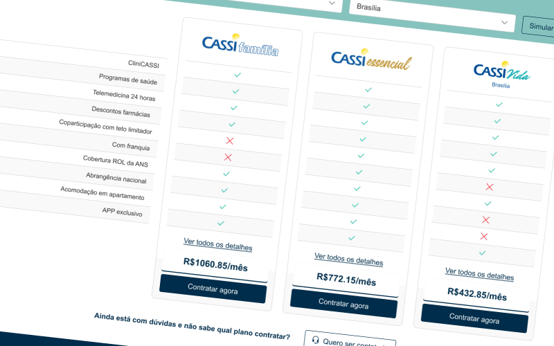
- Reorganization of steps according to the user's mental model: understand options → simulate → choose a plan → fill in data → submit documents → track status.
- Structured status messages and notification points throughout the journey, increasing transparency about proposal progress.
- Two-factor authentication (email and SMS) for proposal validation and follow-up using the provided registration data.
- Review of transactional email flows, aligning content, timing, and journey status.
Results
enrollments through the web portal within one year of launch
proposals: January 2023 vs January 2024
The redesigned version launched in March 2023. Beyond the numbers, the project created reusable flows, screens, and learnings applied to other processes — including plan changes and contract retention. It also enabled lead generation, as contact information began to be collected for communication strategies.